We’ve been asking everyone: Show me the all-cause mortality data proving the vaccines are safe. I finally got some data. It’s from the UK government and it’s devastating. REALLY devastating.
Overview
New UK government data allows us to analyze the data in a way we couldn’t before. This new analysis shows clearly that the COVID vaccines kill more people than they save for all age groups. In other words, they shouldn’t be used by anyone. The younger you are, the less sense it makes.
Anyone can validate the data and methodology. The results make it clear that the COVID vaccines should be halted immediately.
If the vaccines really work, then why hasn’t any government anywhere in the world produced a proper risk-benefit analysis that shows the opposite result?
If the vaccines work, then why do all the lines in Figure 6 below show that Dose 1 and Dose 2 of the vaccines kill more people than they save?
Not a single public health authority in any country will have a conversation with us on the record to justify their vaccine recommendations by producing an all-cause risk benefit analysis similar to what I computed here. I wonder why?
What the data shows
Here’s the result of the analysis comparing unvaxxed vs. 2 doses given at least 6 months ago. I believe this analysis is conservative and the actual numbers are worse than this due to the seasonal variation of the all-cause mortality.
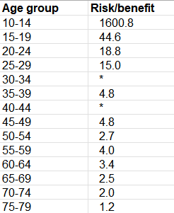
Figure 1. Risk/benefit determination from the UK data shows that for all ages, the vaccines kill more people than they save.
A value of 15 means we kill 15 people from the vaccine to save 1 life from COVID. This is from the Exec Summary tab of the spreadsheet.
The data showed that for most age ranges, the vaccine reduced your chance of dying from COVID, but it increased your chances of dying from other causes. The former effect was smaller than the latter effect so the vaccines are nonsensical.
For example, if you are 25 years old, the vaccine kills 15 people for every person it saves from dying from COVID. Below 80, the younger you are, the more nonsensical vaccination is.
The cells in Figure 1 with a * means that the vaccinated had more COVID deaths than the unvaccinated. This is known as “negative vaccine efficacy.” This wasn’t surprising since we’ve been claiming that the vaccines damage your immune system.
Above 80, the UK data was too confounded to be useful. Until we have that data, it’s irresponsible to make a recommendation.
I describe below how you can compute this yourself from the UK data.
Please share this result on all your social media platforms. One user got 10,000 likes in less than 24 hours on Twitter and he had only 2,000 followers. So Twitter permanently suspended his account. So probably not a good idea to share on Twitter. According to Twitter, “health officials consider the COVID-19 vaccines safe for most people” and therefore any UK government data that shows that they are lying is a violation of Twitter Community Standards.
Introduction
One of my friends recently sent me a link to the mortality data from the UK government Office of National Statistics from January 1, 2021 to January 31, 2022. I had not seen this data before so I analyzed it.
What I found when I analyzed the data was absolutely stunning because it was consistent with the VAERS risk-benefit analysis by age that I had done in November, 2021.
The proper way to do a risk-benefit analysis
To show the vaccines are a beneficial intervention, you’d ideally want to do a randomized trial. We did that and the results showed 7 excess deaths for the single life we saved from COVID. More about that later. But the numbers we too small to be confident they weren’t statistical noise.
Since the trials are now all unblinded, we need to see is a retrospective study of matched individuals with 100,000 in each group selected on December 1, 2020 before the vaccines rolled out to the public.
One group goes the full vax route. The other group shuns the vax entirely.
We then look at the number of COVID vs. non-COVID deaths in each group and compute the risk-benefit analysis as we did earlier. Since each group is nearly identically matched except for the intervention, the comparison is fair.
That’s what we want to see.
What we get in the UK ONS data is something completely different (as we will explain below) and there is no clear way to repurpose that data for our study.
Where to get the UK government source data
The government data is archived here. You want to open the spreadsheet, and look at the spreadsheet tab labeled Table 6.
You can also access the original source here which you can see at the top of the page.
In either case, you click the green button labeled “xlsx” to get the spreadsheet, then go to tab “Table 6”:
To visualize it, see this tweet.
Note: The data is from England only, not all of the UK. On top of that, it is based on people in England who were both a) registered in the 2011 UK census and b) registered with a GP in 2019.
Where to get my analysis of the data
I annotated the UK source data and you can download it here. This makes it easier to see what is going on. You can see all the original data and my formulas for calculating the ACM ratios and risk benefit analysis on the Table 6 tab.
It is all in plain sight for everyone to see. I then copied values to the Summary and Exec Summary tabs from the Table 6 tab.
Interpreting the data
Here’s what the data looks like in Table 6:
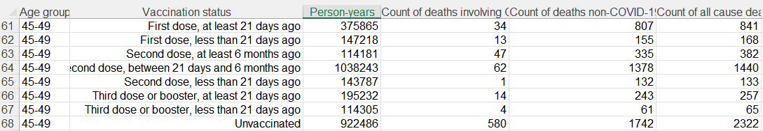
Table 6 example from the ONS table
The definitions of each row is in the Definitions tab of the spreadsheet.
In summary, they track people as they spend time in each row based on their new status. So a triple vaccinated person who was vaccinated more than 21 days ago will spend time in every row except possibly the “Second dose, at least 6 months ago” which they would be able to skip if they got boosted before the 6 month waiting period. So if they waited 7 months before getting boosted, they’d only spend a month in that category. If people decided they weren’t high risk enough to get boosted, they’d accumulate time in the 2nd, 6+ category.
So that means if the vaccines are as deadly as we claim, the benefits of the vaccine against COVID will be minimal in the <21 days ago category and the ACM elevation over the unvaxxed should be the highest there. In short, the <21 days is the category where we should see the strongest risk-benefit signal so if you were an evil anti-vaxxer, this would clearly be the row you’d want to cherry pick to prove your point.
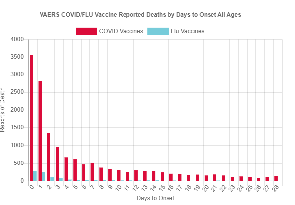
Conversely, if you were cherry picking for data to support your evil anti-vaxxer mission, the very last place you’d expect to find a strong signal is 6 months after the second dose since most of the people killed by the vaccine were killed in the 30 days after the shot as you can see from this graph from openvaers:
Furthermore, the non-COVID ACM in the unvaxxed group is going to be very high (since it peaks in Q1 when most people were contributing time in that group); that’s going to work against you. And as far as effectiveness, we all know these vaccines do wane over time, so there is still going to be a lot of protection left at that point.
So for the 2nd dose, 6m+ group, we have:
- Low likelihood of death from the vaccine
- ACM for the vaxxed will be naturally lower due to seasonality (lowest in Q3)
- High ACM for the unvaxxed (which peaks in Q1)
- Degraded, though still impressive protection from the vaccine at that point
In short, all four of these major factors works against you if you are an evil anti-vaxxer. It would be absolutely the worst row to examine to prove your point. It’s much more likely to show the vaccines are effective.
Which means if you can show there is a strong signal against the vaccines on this row, that’s really powerful since this has to be the row with the weakest case against the vaccines.
So this is exactly what we are going to do here: prove using the UK data that there is a very strong danger signal in the hardest place to find it.
The quality of the data
The data quality here is strongly biased in favor of making the vaccine look effective.
They are massively underestimating the proportion who are unvaccinated and they are putting ludicrous faith in the accuracy of the NIMs and GP records. Fenton and his team have written extensively about the problems with miscategorization in the ONS data and missing vaccination deaths.
The other huge problem with the data is that it shows that if you died, the % of COVID related deaths ranged from 10% in the very young to over 40% in the elderly if you were not vaccinated. That’s impossibly high. In 2020 in the US when everyone wasn’t vaccinated, the % of COVID deaths was 15%. The numbers in the ONS database just don’t make sense.
The data is not available for researchers to use freely; you have to tell the ONS up front what your study is about before you are allowed to look at the data and they have to approve any publication you want to make. So if you find something bad, you can’t talk about it. This isn’t government transparency. It is the opposite.
The ONS data and reports are produced by a team led by Vahé Nafilyan and Charlotte Bermingham. They are the lead authors on this March 23, 2022 paper which claims that it was COVID (and not the vaccines) that was causing cardio problems in young people. Here’s what they wrote:
There was a decrease in the risk of all-cause death in the first week after vaccination and no change in each of weeks 2 to 6 after vaccination or whole six-week period after vaccination. Subgroup analyses by sex, age, vaccine type, and last dose also showed no change in the risk of death in the first six weeks after vaccination
There is no way that can be right because it doesn’t match any reality I’ve ever seen. So this is yet another example that the ONS data is HIGHLY skewed to be favorable for the vaccine.
What this means is that it should be nearly impossible to find anything negative in the data, even if you were cherry picking because according to the authors the vaccine is perfectly safe and is massively effective.
You’d normally then look in the place most favorable to support an anti-vaxx hypothesis.
So it is stunning that in the last place anyone expected to find a signal, we find a very strong signal. Here, we found it across every age group under 80 without exception. That cannot happen by chance. We picked the exact same row for each age group and we picked the worst possible row. You cannot explain that away no matter how hard you try. It should have strongly favored the vaccine as safe and effective, yet we found exactly the opposite. That’s stunning.
Does the COVID Jab Kill More People Than It Saves?
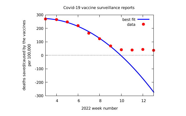
Also, the Substack article, All-Cause Mortality by Vaccination Status, is excellent and provides a wide range of charts that are particularly illuminating showing visually that the the vaccines are not as safe as people claim. Just look at the black link here which is the unvaccinated.
Lines above the 1x line are cohorts where the vaccine is nonsensical. In short, over time, it becomes more and more obvious that the vaccines are a disaster.
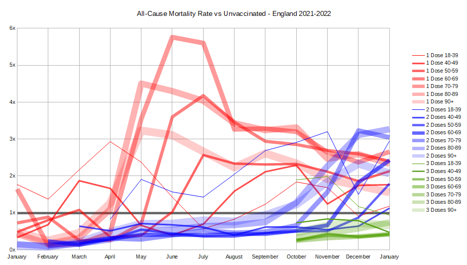
Figure 6. Only at the start of the data collection period did the numbers look favorable for the vaccine. They all turn negative over time for Doses 1 and 2 over time meaning the vaccines are nonsensical. No cherry picking required. You can see it visually. Source: All-Cause Mortality by Vaccination Status
The article concludes:
This data is all very alarming. A poorly functioning vaccine should still have at least a small positive effect. A non-functioning vaccine should have no effect. Yet we see a negative effect in all age groups for both 1 or 2 doses taken ‘at least 21 days ago’, and it is most cases the negative effect is quite large. The fact that the pattern is consistent and predictable, meaning it moves smoothly from month to month and age bracket to age bracket, gives even more credibility to the pattern.
It’s a great read.
Methodology
I compared the all-cause mortality (ACM) for people who got 2 shots at least 6 months ago with the unvaccinated since this was the row that would be the most difficult to show an anti-vaxx signal.
Our goal in this analysis was not to get definitive numbers. We describe later the proper way to do a risk-benefit analysis. Our goal was to show that the vaccines are dangerous even if you look at a row that is least likely to make your point.
Summary of the data
This summary below (which I put on the Summary tab which is to the right of the Table 6 tab) shows the rates of all-cause mortality per 100,000 person-years for each age range and also shows the risk benefit ratio.
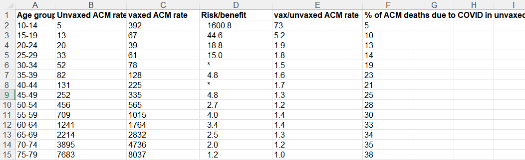
Figure 2. A summary of the calculations from the UK data. This is shown in the Summary tab of my spreadsheet.
Here’s the legend for each column:
- A: age range for the row
- B: ACM rate for unvaxxed
- C: ACM rate for vaxxed
- D: Risk benefit calculation which is # non-COVID lives lost due to the vaccine / # of COVID lives saved from the vaccine. This is the single best metric for justifying the use of an intervention. The larger this number is, the less sense the intervention makes. A value >1 means the intervention should never be used. The cells with * means that the vaccine actually caused more COVID cases to happen than the unvaccinated. Note: you need to view the full spreadsheet to see the data used to calculate this number. You cannot do it from the summary data on this screen.
- E: ACM of vaxxed/ACM unvaxed, i.e., Column C/ Column
B. A value >1 means the intervention should never be used since it is costing lives. This is a crude measure of the effectiveness of an intervention as we explain below. - F: % of ACM deaths due to COVID, i.e., the fraction of all the ACM deaths that were caused by COVID.
The data clearly shows that any mortality benefit you get from taking the vaccine and lowering your risk of death from COVID is more than offset by the mortality you lose from the vaccine itself. This isn’t new. It is something I have been saying since May, 2021. But now I finally found direct government data where I could demonstrate this for all ages under 80.
In the Pfizer Phase 3 trial, there was a 40% increase in ACM in the vaccinated group. They killed an estimated 7 people for every person they saved from COVID!
In the Pfizer Phase 3 trial, there were a total of 21 deaths in the vaccine group and 15 deaths in the placebo group.
This 40% increase in the all-cause mortality in the trial (21/15=1.4) was of course dismissed as not statistically significant. While that is true, that doesn’t mean we shouldn’t pay attention to the number.
But now, based on the UK data, we know that the result in the Phase 3 trial wasn’t a statistical fluke. Not at all.
In fact, if we look at the risk benefit, we see that we saved 1 life from dying from COVID (1 COVID death in the treatment group vs. 2 COVID deaths in the placebo group= 1 life saved), but there were 7 excess non-COVID deaths (20 – 13).
So the Pfizer trial showed that for every person we saved from COVID, we killed 7 people. However the numbers were too small to place a high confidence in this point estimate.
However, I’d argue that Pfizer trial was a best case because:
- The trial enrolled abnormally healthy people who died at a 10X lower rate than the population (there is a 1% US average death rate per year, yet there were just 15 deaths in the 22,000 placebo arm in 6 months which is a .1% death rate)
- They were able to get rid of anyone who had a reaction to the first dose without counting them
The most important point though is that the Pfizer trial killed: save ratio of 7:1 and the ACM ratio of 1.4 is consistent with the hypothesis that the vaccine kills more people than it saves.
My ACM risk/benefit estimate using VAERS
This is from a risk/benefit computation I did on November 1, 2021 using the VAERS data to compute the ratio of the # of people killed from the vaccine (V) to the # of people who might be saved from COVID (C) if they took the vaccine and it had 90% effectiveness over 6 months (since we knew it waned over time and variants would change). Of course that was a conservative estimate of the benefit, but that’s because I wanted to make sure I was on solid ground if attacked.
So now we know that my VAERS calculations approximately match the actual UK data in Figure 1. Since my analysis was deliberately conservative, many of the numbers are smaller than the actuals.
This is another example that people who claim (without evidence) that the VAERS data is too “unreliable to use” are wrong. If it is so unreliable, how did it match the real world UK results so well?
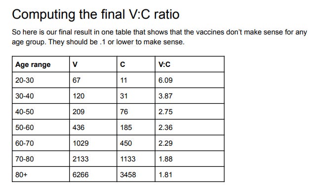
Figure 3: Risk-benefit analysis from VAERS
Note how that VAERS showed exactly the same effect back then that we just learned from this UK data: that the younger you are, the more nonsensical getting vaccinated is.
Our V:C column decreases as you get older (from 6:1 down to 1.8:1) just like column E decreases (from 1.9:1 to 1:1 over the same range) in Figure 2.
Isn’t that an interesting “coincidence”? They are within a factor of 3 of each other.
Confirmation from others
I’m hardly the only person noting that the COVID vaccines kill more people than they save. Other articles show either no benefit at all or a negative benefit.
For example, check out:
- 99.6% of COVID deaths in Canada were among fully vaccinated people between April 10-17 which can only happen if the vaccinated have a great ACM than the unvaccinated since there is only an 86% vaccination rate in Canada. This is hard for anyone to explain.
- Fully Vaccinated 6x Higher Overall Mortality Than Non-Vaccinated (October 30, 2021)
- Follow-up of trial participants found ‘no effect on overall mortality’
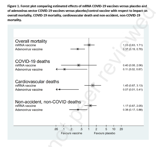
Figure 4. Table from the Denmark paper published as a preprint in the Lancet
Note that the Denmark paper (pre-published in the Lancet) showed overall zero all-cause mortality benefit based on clinical trial data. That’s certainly more optimistic than the UK numbers, but the problem for the vaccine makers is that the UK numbers showed up to 38% of the deaths were from COVID so if the vaccines actually worked and were safe, you’d see a huge ACM benefit and you saw nothing.
Why are we mandating a vaccine with a zero ACM benefit?? No public health official wants to answer questions about that.
What makes this analysis different than previous work
The UK ONS data is more detailed than in the more frequently cited UK Health Security Agency summaries. It contains both COVID and non-COVID deaths by age. We haven’t had that before February 2022.
This enables me to validate the data as I explain in the next section.
Why I picked the 2nd dose, 6 month row only
There are three reasons I picked the 2nd dose, 6 month row for the comparison with the unvaccinated:
- It is the hardest row to make a case since most vax deaths happen within 30 days after the vaccine. So if I can prove the vaccine is dangerous for this row, it’s simply stunning. You don’t expect any excess non-COVID ACM deaths from people 6 months from their last dose of the vaccine.
- The data in this row consistently met a very simple sanity test which allows for a fair comparison (described below)
- The vaccines were still effective in preventing COVID deaths in this row, e.g., for age 50-54 there was still a 50% efficacy in reducing COVID deaths which is in line with assertions by the government about effectiveness (64 COVID deaths rate delta for the vaccinated vs. 127 COVID death rate for the unvaxxed).
So nobody can really accuse me of “cheating.” This is the most difficult row to make a my case.
One commenter speculated anyone in this bucket must be sickly which explains the higher non-COVID ACM. That’s wrong. Anyone sickly wouldn’t have even made it into the bucket. They would have been killed by COVID or the 2 doses long before entering the 6 months from COVID shot bucket. If they made it into this bucket, these people are super healthy.
The sanity test
The all-cause mortality (ACM) rates for NON-COVID deaths in the vaxxed cohorts should be the same as the rates for the unvaccinated for a perfectly safe vaccine; it should be higher for sure for this vaccine as we know from VAERS; we have over 10 ways showing that this vaccine significantly INCREASES your non-COVID ACM.
Note that a number of people claim that Professor Christine Stabell Benn has said that vaccine can positively affect your ACM. While this might be true theoretically for a perfect vaccine, nobody I know has pointed me to any real-life vaccine that has this “fountain of youth” property for anything other than the disease the vaccine was designed for. Bobby Kennedy Jr. tried for 20 years to get a debate on this and nobody would challenge him. In particular, all the COVID vaccines share the same problems of increasing ACM. You can see it very clearly yourself in Figure 6 above. All ages, doses 1 and 2. The ACMs are all worse.
Therefore, anytime that non-COVID ACM is lower for the vaccinated than the unvaccinated in a given age cohort, the row is unreliable (either corrupt or seriously confounded, e.g., by season). Others noticed this as well; without being able to adjust the data, we get nonsense results. Adjusting for bias is a huge task and would be subject to “data manipulation” attacks which would open up another level of attack. So we resigned our analysis to using data we didn’t have to normalize. The 2nd dose, 6 month row fit our purposes.
If I ignored the sanity check and include all the data for the vaccinated in the UK report, then the vaccines are marvelous life savers but ONLY if you are 25 years old or older. The vaccine will keep you from dying from cancer, car accidents, etc. especially if you are elderly. It’s like a fountain of youth for the elderly if you do that. Which doesn’t jive at all with reality where funeral home directors like John O’Looney couldn’t believe how many calls he was getting of elderly that had died when the jabs rolled out. The point is simple: Garbage data in, garbage data out.
Here’s a more in-depth explanation of the confounding due to survivor bias which explains why these data sets are not constructed for our purposes.
Could my sanity check be wrong because the vaccine is actually able to keep you from dying from all diseases and also accidents as well? Very unlikely. VAERS would be empty if this drug reduced adverse events and doctors would report elderly people being cured of disease. Instead of adverse event reports, doctors would be filing Beneficial Event Reports (BER) after vaccination.
I’ve written about this supposed “fountain of youth” effect on November 12, 2021.
The bottom line is data analysis is tricky so sanity checks are important if you want credible results.
Should those over 80 get the shot?
My VAERS analysis said no.
The anecdotal data from nursing homes from whistleblowers all says no (see slides 53 to 59). This includes Abrien Aguirre on Oahu, Sunnycrest nursing home in Canada, and John O’Looney’s experience, and experience from embalmers where most of the bodies being embalmed have telltale blood clots caused by the vaccine.
Based on curve fitting, it doesn’t look good for the elderly, for either (see this reader comment for details).
The UK dataset used in this article was too confounded to use since the non-COVID ACM rate for the vaccinated was lower than the vaccinated so it didn’t meet the sanity check.
All the anecdotal data I hear is strongly negative. The ONS data shows the COVID vaccines are a fountain of youth and will cut your risk of dying from every cause in half.
If I was over 80, I wouldn’t get the shot until I saw reliable, self-consistent data showing a clear benefit from multiple independent sources. Seen any of that lately?
If I am vaccinated, should I continue to get my boosters, or not?
Consider that 75% of the people in the radiology department of Marin/UCSF got religious exemptions so they didn’t have to take the booster.
Does that help? They aren’t reading ONS data. They are seeing patients with 1, 2, and 3 doses of the vaccine.
We see over and over that each shot increases your risk of side-effects and death.
It’s like asking the question: “The first bullet I fired into my brain didn’t kill me. Should I try again?”
ACM ratio vs. risk/benefit analysis
Now that we have the basics out of the way, I want to explain in greater detail the difference between the ACM ratio and the risk/benefit number and why the latter is what we should be focusing on.
For example, Toby Rogers estimated that we kill 117 kids from the COVID vaccine for every child we might save from dying of COVID in the 5 to 11 age range.
Here, in an even older cohort (10 to 14), we found it is 1600 to 1. The problem with this young age range is that there are so few deaths, that there is a lot of statistical noise since the denominator is so small (close to 0). But the UK data clearly showed that vaccinating kids younger than 20 years old is insane. Arguing whether it is 117 or 1600 is like rearranging deck chairs on the Titanic. Just say “no.”
Here’s a simple example to illustrate the difference between the ACM ratio and the risk benefit analysis:
- Suppose 100 people per 100,000 die per year normally in a particular age group.
- We have a vaccine that saves 1 life per person, but kills 10. That’s a lousy intervention because it kills 10 times more people than it saves.
- But if we compare the ACM rates of the two groups, we’d have 100 in the unvaccinated group and 109 dead people in the vaccinated group. So the ACM ratio would only be 1.1, a 10% increase. But the risk/benefit is 10:1 more risk than benefit.
So that’s why the risk-benefit ratio is the number to look at, not the ratio of the ACMs of each group.
Attempts to debunk this
Daniel Wilson, aka “Debunk the Funk,” cited Morris’s article (UK death data artifacts: “Stragglers” who delay vaccine doses a select group with higher death risk) when I asked him to debunk this article. No other explanation provided.
Morris claims that people who vaccinate late have higher death rates.
First of all, I wasn’t impressed with Morris’ analysis, but even I believed it, it’s completely irrelevant because the category I chose weren’t “stragglers” (since the biggest contributors got their second dose long long ago) and as I noted earlier, it is the single hardest row to see a signal. These people survived COVID and survived two shots so their ACM should be way lower than the average unvaccinated person. Basically, people in this category got shot early with two bullets and are still alive.
So much for the hand-waving debunk attempt.
My result is very consistent with other reliable independent data points that I know. If you want to debunk me, show us how, using exactly the same dataset, you can get a more accurate estimate of the “true” value. I’m skeptical anyone can do that, but I’m open to being shown a better way.
It turns out Table 6 wasn’t the best table to have used.
Take a look at Figure 6 above. After a startup period, the data all settles out and all dose 1 and dose 2 curves show higher ACM than the unvaccinated. No cherry picking or sanity test needed. A raw, untouched data.
So that’s an independent look at the data showing very visually that “whoops, these vaccines are killing more people than they save.”
You can do worse than this analysis; that’s easy
For example, this table from Morris’ article is from the UK dataset as well, and it indicates you are way better off if you got the vax.
Figure 5. Table from Morris article
The problem is death rates that are as low as 20% of the unvaxed death rate (as noted in this table) doesn’t match reality such as the up to 21X increase athlete deaths (Jan 2021 vs Jan 2022) that we can see in plain sight. Nobody has been able to explain away the athlete data, not even Professor Glen Pyle. While government data can be manipulated, athlete deaths cannot be manipulated because they are public. Which do you trust more? Clearly, the data that is in full public view.
Also, in Table 3 of the UK data, it says if you’ve been vaccinated with COVID, you have close to half of the non-COVID ACM death rate as the unvaccinated (compare E23 with E31).
In other words, according to UK government data, the vaccine is a fountain of youthbecause it will reduce your non-COVID ACM by a factor of 2. It’s just not believable. There is no mechanism of action that can do that and you’d expect the VAERS reports (and individual doctor reports) would all be lower than previous vaccines in all categories rather than off the charts.
Furthermore, if the COVID vaccines reduced non-COVID ACM by 2X, the government would be shouting this from the rooftops as a miracle cure for all diseases. They aren’t. They are silent. What does that tell you? It tells you the UK government is smart enough to realize the data is confounded and you can’t make such assessments: you can’t say it is safe, and you can’t say it is dangerous.
Figure 5 above is also inconsistent with Canada’s high rate of fully vaccinated deaths, the huge number of VAERS reports, reports by individual doctors of 100X or more increase in adverse events after vaccination, Facebook groups with hundred of thousands of vaccine victims, the huge spike in athlete deaths, the 75% of radiologists at UCSF/Marin who refused the booster, etc.
Limitations
Here are some limitations of using the UK data courtesy of Martin Kulldorff, the most important one being the first one.
Does this cause me to doubt the results? No. I specifically chose the row I did to minimize these confounders. These limitations mean my results are conservative (because the seasonality skew of the vaccinated increases their non-COVID ACM). We also have way too many real-world confirmation points that could not be explained if the vaccine were beneficial (see my list of questions).
- Seasonality: In England, all-cause mortality is highly seasonal, as is COVID mortality as well as COVID vaccinations. This creates a bias in the analysis. There is much more unvaccinated person time during the early part of 2021, while there is much more D2 6+ month person time in the later parts of 2021 and January 2022. To adjust for this bias, in whichever direction it goes, it is necessary to adjust for calendar time. Depending on the data, that can be done in different ways. Note that this bias affects the results differently for different age groups, both because the rollout of the vaccine varied by age group and because the seasonal mortality patterns may differ by age.
- Negative efficacy on COVID: The negative efficacy on COVID mortality in the 30-34 and 40-44 age groups (the * rows) may seem counter intuitive, but there is a likely explanation. The same phenomena was seen an a recent New York State analysis of COVID vaccines in children. In that study, the vaccine was effective at preventing symptomatic COVID during the first few weeks after vaccination, but for 5-11 year old children, the efficacy we negative after seven weeks, so that there were more COVID in the vaccinated than the unvaccinated. The likely explanation for this is that the vaccine provides temporary protection during the first few weeks, so after 7 weeks we are comparing unvaccinated children with a high proportion of natural immunity from having had COVID with vaccinated children with a lower proportion with natural immunity. This phenomenon will be seen with any vaccine that only gives short-term protection, and it could potentially also affect COVID mortality statistics. Suppose that the vaccine does not prevent COVID deaths, but just postpone them until a later date. Then there may be a vaccine benefit seen 0-6 months after vaccination, but a vaccine harm 6-12 months after vaccination. When Pfizer and Moderna only evaluated the vaccines for a few months, that give incomplete and potentially misleading information about the efficacy of the vaccines. The same is true if we only look at a subsequent tie interval of e.g. 6-12 month after the vaccination. There are ways to overcome this issue, but I am not sufficiently familiar with the English data to know if it can be extracted from that.
- Prior COVID infection: The unvaccinated group consists of two sub-groups,(i) those who have recovered from COVID and who hence have natural immunity to COVID, which is superior to vaccine induced immunity, and (ii) those who have never had COVID. People with natural immunity have minuscule if any benefit from the vaccine on COVID disease and should not be vaccinated. To determine whether those without a prior COVID infection benefit from vaccination, it is necessary to compare the vaccinated without a prior COVID infection with the unvaccinated without a prior COVID infection.
- Risk metrics: Although both are worth calculating, I agree that risk/benefit is a more relevant number of vaccine efficacy than vax/unvax ACM rates. The best metrics to evaluate the vaccines is not a risk ratio though, but attributable risk. That is, for every 1,000 people who get the vaccine, or for every 1,000,000, how many deaths are prevented by the vaccine or how many deaths are caused by the vaccine.
Could the underlying UK data be wrong?
There are always going to be studies that contradict other studies.
There are always going to be compromised data sources, the DMED data being another recent example.
There are always going to be seemingly credible sources of data that are not as credible as they seem at first glance.
So yeah, as I noted in the section above, the ONS data provided was less than ideal.
Our job is to sort out the reliable data from the unreliable data. We do that by using multiple pieces of independent evidence from credible sources and doing sanity checks on the data we use.
My results agreed with other data I’m aware of so I’m reasonably happy with the quality of the data, e.g., the risk/benefit went down with increasing age in a way that matched my expectations.
“Show me the DATA”
All my analysis here serves one purpose which is to highlight the point that you can make a very legitimate case that these vaccines do nothing and at worse, make things worse. I’m hardly alone in this belief. Showing us different rows in the ONS data shows a different result, but doesn’t cause the red flag to disappear.
The only way you can trump the red flag I pointed out is to do a PROPER analysis.
Remember the movie Jerry Maguire where Rod Tidwell advises Jerry that to keep him as a client all Jerry has to do is “Show me the money!”?
We should all be asking the same thing of the CDC but instead of money, we should be asking them to “Show me the DATA!”
Why isn’t the CDC showing us the ACM study that we need? Namely:
We want to see two matched groups, one who took the intervention, the other that didn’t, and see who is standing at the end of the 1 year period.
Where is that study? The data exists.
There is a reason the proper study does not exist. Because it would make it clear to everyone that nobody should get jabbed.
Without seeing that study and the underlying data, nobody of any age should get the jab or recommend it.
I’ll go even further and say:
- It is irresponsible for the CDC to keep that data hidden from public view.
- It’s irresponsible for the medical community to not demand to see this data.
- It’s irresponsible for the medical community to encourage anyone to get vaccinated without seeing this data especially in light of the alarming data in VAERS and other sources.
Summary
Based on this new UK government data, we can estimate a true risk-benefit ratio for each age group. For all groups, it’s negative. The younger you are, the less sense it makes to take the vaccine. Figure 6 is a visual way to see this. All the dose 1 and 2 curves are above the unvaccinated line.
It shows clearly that our governments have been publicly killing us with these vaccines and vaccine mandates.
The data was used is fully reported data right from the UK government and the math is straightforward. The row I used was not normalized or manipulated. It was the hardest row to prove my point. The only way to explain the results is that the vaccines kill more people than they save. But you can also look at Figure 6 too.
At a minimum, this result should cast serious doubt about the safe and effective narrative. I took a dataset that was clearly biased to show a positive vaccine result and found a hugely negative signal hidden inside by selecting data that should have shown the opposite. No tricks were used. That shouldn’t have been possible if the vaccine was really safe.
We need to see a proper analysis on the data and we need to see it now.
The medical community has never demanded to see a proper risk-benefit study before recommending the vaccines. To this day, they continue to this day to keep their head in the sand and not demand to see the ACM data. It’s deplorable.
Until we see the data and the study and validate both showing the vaccines are safe and effective, the vaccines should not be used.
Please share this article and help us get the word out.


Recent Comments